Fonts
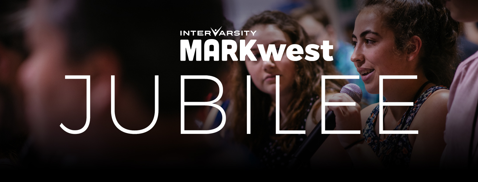
In all of our messaging about InterVarsity ministries and programs, our goal is to communicate a “Bold and Courageous Faith in Jesus.” We do this through images, words and graphic elements like colour and font choice. When it comes to fonts, we have one style for headlines and another one for body text. However, we will make an exception on this rule when a Headline text design is more effective by using two contrasting texts next to each other. In that case, one of our Body text fonts may be used in conjunction with one of our bold fonts (see example below).
 Below are the fonts we are using at a national level to tell our story. Feel free to use the fonts below (or their font equivalents) as you design tools and resources for our local ministries.
BODY COPY FONT

RECOMMENDED USES: Official letters, custom website body font, footer section text
FONT EQUIVALENTS: Futura Book, Montserrat Regular, Gil Sans Light
HEADLINE FONTS

RECOMMENDED USES: Posters and flyers, T-shirt design, header section text, banners
FONT EQUIVALENTS: Montserrat Extra Bold, Futura Md BT, Gil Sans Bold

RECOMMENDED USES: Decorative posters and flyers, event banners, T-shirt design
