Colours
Quick Links:
Official Colours
Colour Codes 101
Choosing a Background Colour
Colour Combinations
OFFICIAL COLOURS
 |
 |
 |
 |
 |
 |
 |
 |
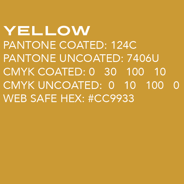
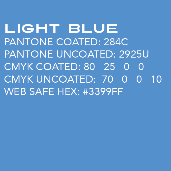
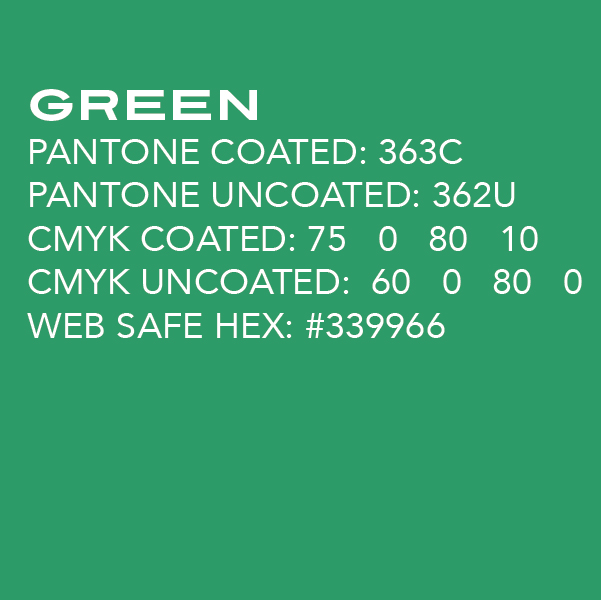
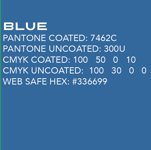
COLOUR CODES 101
PANTONE COATED: Pantone is a colour matching system used by printing and tee-shirt companies to allow you to specify colors by indicating the Pantone number. This ensures that you get the right colour when the file or design is printed even though the colour may not look right when displayed on your monitor. The word “coated” refers to the paper the design is printed on. A coated paper has a shiny/treated finish that prevents ink from sinking into the fibers. Inks printed on coated materials appear brighter and sharper and require a particular ink formula to compensate.
WHEN TO USE PANTONE COATED: Use this when printing a SINGLE-COLOUR PROJECT (a single-colour print piece often saves money and allows you to achieve reliable colour results) on COATED PAPER or when specifying colours to a TEE SHIRT company who should have a Pantone Coated colour matching book on reference.
PANTONE UNCOATED: See above for a brief description on the Pantone colour matching system. “Uncoated” refers to the type of paper the project is printed on. Uncoated papers are pourous and absord ink. This causes the ink to spread creating a darker soft-edged effect. The ink formula used on this paper must compensate for the absorption.
WHEN TO USE PANTONE UNCOATED: Use this when printing a SINGLE-COLOUR PROJECT (a single-colour print piece often saves money and allows you to achieve reliable colour results) on UNCOATED PAPER.
CMYK COATED: CMYK refers to a four-color printing process that uses only cyan, magenta, yellow and black inks. This is primarily used for printing brochures, business cards, posters and other paper-based products. The word “coated” refers to the paper the design is printed on. A coated paper has a shiny/treated finish that prevents ink from sinking into the fibers. Inks printed on coated materials appear brighter and sharper and require a particular ink formula to compensate.
WHEN TO USE CMYK COATED: Use this when PRINTING A COLOUR PROJECT on COATED PAPER (shiny/treated paper).
CMYK UNCOATED: CMYK refers to a four-color printing process that uses only cyan, magenta, yellow and black inks. This is primarily used for printing brochures, business cards, posters and other paper-based products. Uncoated papers are pourous and absord ink. This causes the ink to spread creating a darker soft-edged effect. The ink formula used on this paper must compensate for the absorption.
WHEN TO USE CMYK UNCOATED: Use this when PRINTING A COLOUR PROJECT on UNCOATED PAPER (regular/non-shiny paper).
WEB SAFE HEX: A HEX colour is used to indicate screen colour values (displayed on computers, televisions, smart phones and other electronic devices). While some electronic displays can achieve colours more closely related to the Pantone colours in our palette, other screens would render the colours inconsistently (sometimes creating jarring colour effects). To counter this variation, a web safe palette was created. “WEB SAFE” refers to a small palette of 216 colours that are thought to display more consistently across all electronic devices.
WHEN TO USE WEB SAFE HEX: Use this when designing WEBSITES, POWERPOINT PRESENTATIONS and VIDEO PROJECTS.
CHOOSING A BACKGROUND COLOUR
Choosing a background colour is not always easy. Try to keep in mind readability/contrast as you do so. Below are examples of colours that work well with each of the shown backgrounds from the colours in our palette.

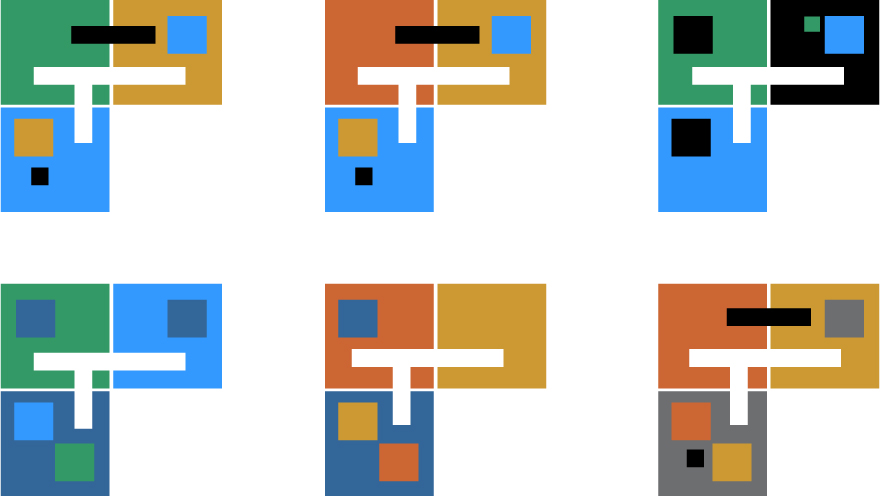
COLOUR COMBINATIONS
While all the colours in our palette are meant to work well together, when using only two or three of them, be aware they may not all work well outside of the whole family. When designing something with just two or the three of the colours from our palette, below are some examples of colour combinations from our palette that work particularly well.
TWO COLOUR COMBINATIONS
These are examples of the use of two colours in our palette in combination with black and/or white. These may be particularly helpful if you are designing something simple you want to look really superb with the colours in your logo.
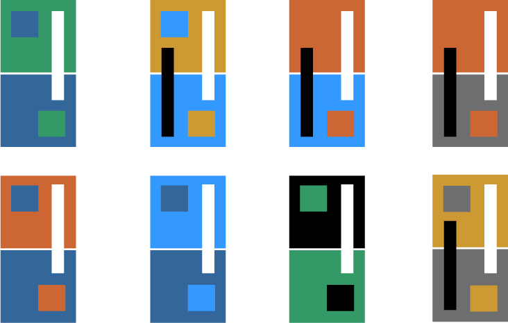
THREE COLOUR COMBINATIONS
Using only three colours in our palette in combination with black and/or white can be particularly challenging. Try these colour combos when you want a design to work well with your logo.