Logos
Quick Links:
National Logo
Camp Logos
Campus Logos
Logo Don’ts
+ How do I choose the right logo? For Camp Staff – Use the logo for your specific camp For National Services Staff – Use the national logo with blue background For Executive Leadership – Use the national logo with blue background For Campus Staff – Use the campus logo related to your specific ministry (Undergraduate, Graduate, KCF, International) For Campus Leadership [Campus Leadership Team and Staff Directors] – Use the national logo with background of your choice (blue, green or orange) To view all our logos, click here. STANDARD: SIZE MINIMUM: SPACING: As a general rule the height of the letter N is the minimum distance, however, twice that is required on the top of the logo. STANDARD: SIZE MINIMUM: SPACING: ONE COLOUR (ONLY WHEN NECESSARY): ON DARK BACKGROUND: STANDARD: SIZE MINIMUM: SPACING: ONE COLOUR (ONLY WHEN NECESSARY): ON DARK BACKGROUND: DON’T: LOGO SCALING DON’T: LOGO COLOUR DON’T: LOGO FONT DON’T: LOGO EFFECTS DON’T: LOGO ADDITIONS DON’T: LOGO ALTERATIONHOW TO CHOOSE THE RIGHT LOGO/DESIGN FOR YOUR MINISTRY:
NATIONAL LOGO
![]()

This is our logo. Different file formats are available on the downloads page in our online style guide. The logo may appear in black (on light backgrounds) or in white (on dark backgrounds).

The logo should appear no smaller than 1.5”.

Clearance space around the logo should be enough to ensure that the logo does not look cramped by nearby elements. The grey box to the left is a good guideline for the amount of space the logo needs.
CAMP LOGOS

All camp logos are designed in two colours – black and an accent colour (in this case, black and Pantone 363C for the green). Different file formats are available on the downloads page. If you are using a printing service, reference the colour pallette for specific information on your accent colour. If you are printing material on an office or home printer, please try to match the colours as closely as possible.
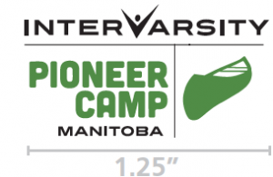
The logo should appear no smaller than 1.25”.
Clearance space around the logo should be enough to ensure that the logo does not look cramped by nearby elements. The grey box to the left is a good guideline for the amount of space the logo needs.
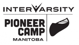
There are rare circumstances in which you can only show your logo in a single colour (one colour print publications, t-shirt screens, embroidery, some swag elements, signage). For these circumstances, please use only black or white. Check with the Communications Department for exceptions.
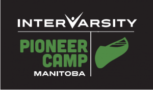
The logo may also appear with the back parts reversed (in white) when background colour is too dark for the logo to be readable.
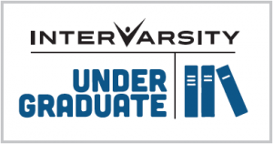
CAMPUS LOGOS

All campus logos are designed in two colours – black and an accent colour (in this case, black and Pantone 7462C for the blue). Please use the logo specific to your ministry. Different file formats are available on the downloads page. If you are using a printing service, reference the colour pallette for specific information on your accent colour. If you are printing material on an office or home printer, please try to match the colours as closely as possible.
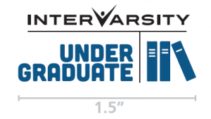
The logo should appear no smaller than 1.5”.
Clearance space around the logo should be enough to ensure that the logo does not look cramped by nearby elements. The grey box to the left is a good guideline for the amount of space the logo needs.
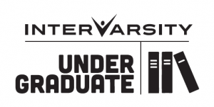
There are rare circumstances in which you can only show your logo in a single colour (one colour print publications, t-shirt screens, embroidery, some swag elements, signage). For these circumstances, please use only black or white. Check with the Communications Department for exceptions.
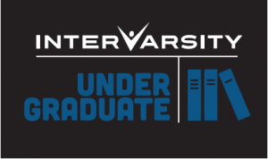
The logo may also appear with the back parts reversed (in white) when background colour is too dark for the logo to be readable.
LOGO DON’TS
![]()

Please do not “squish” the logo to fit into a certain space. Scale the logo proportionally.


As tempting as it may be to represent the logo in the season’s trendy colours, please adhere to the colour specifications on pages 1 and 2.


You may not like the font of our logo or feel it lacks friendliness or a certain pizazz. This does not mean you have license to change it. Please use the logo exactly as it is and do not depict “Inter-Varsity” in any other way.
![]()
I know you might love to make it look like flames are shooting through the logo. Or you might really love the embossed effect. But please don’t alter the logo – not even by simply giving it an outline.

Please do not add any design/image to the logo. All camp and campus ministries have designed logos that incorporate the national logo. For information specific to your ministry logo, click on “camp” or “campus”.

It might fit better in the space allotted for a Twitter avatar, but that doesn’t make it right. Please do not move any part around on the logo or change the dimensions of a particular section.